
When I first tried to create a landing page, I started with a blank page inside landing page software.
I stared at it.
Then I stared at it some more.
I was supposed to choose the layout, write the headline, decide where the button went, find the right images, explain the offer, and somehow know which section came next.
I never finished the page.
Later, I took a class that gave us a landing page template. I could copy the layout, replace the language, add my own call to action, and use my own images.
It was so much easier.
The template answered the hardest first question: Where do I start?
It still took a significant amount of time to replace everything. And when my offer did not match the template exactly, I had a new problem. The template wanted three benefits when I had five. It gave me space for two images when I needed six. The layout worked beautifully for the original example and awkwardly for mine.
That is the catch-22 with landing page templates.
You want a proven structure…
…BUT…
…you do not want your sales page to look and sound exactly like everybody else’s.
Pagewheel was built to give you both.
It gives you a strong starting point, then lets you change the sections to fit the actual offer. Three benefits can become five. Two images can become six. You can remove a section, add one, or change the order as the page becomes clearer.
A useful template should get you moving.
It should not trap you.
What Is a Landing Page Template?
A landing page template is a prebuilt structure for one page with one job (one call-to-action or CTA).
Common landing page CTA’s:
- collecting an email address
- selling a digital download
- enrolling someone in a course
- registering someone for a webinar
- getting a qualified coaching lead to book a call
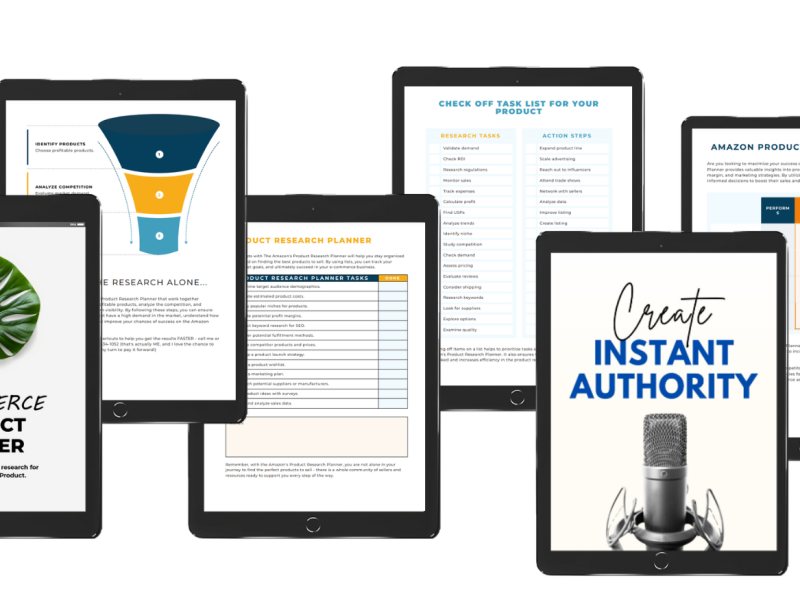
The template gives you a starting order for the page sections. It may include a headline, product preview, benefits, testimonials, pricing, and a call to action.
The design is helpful.
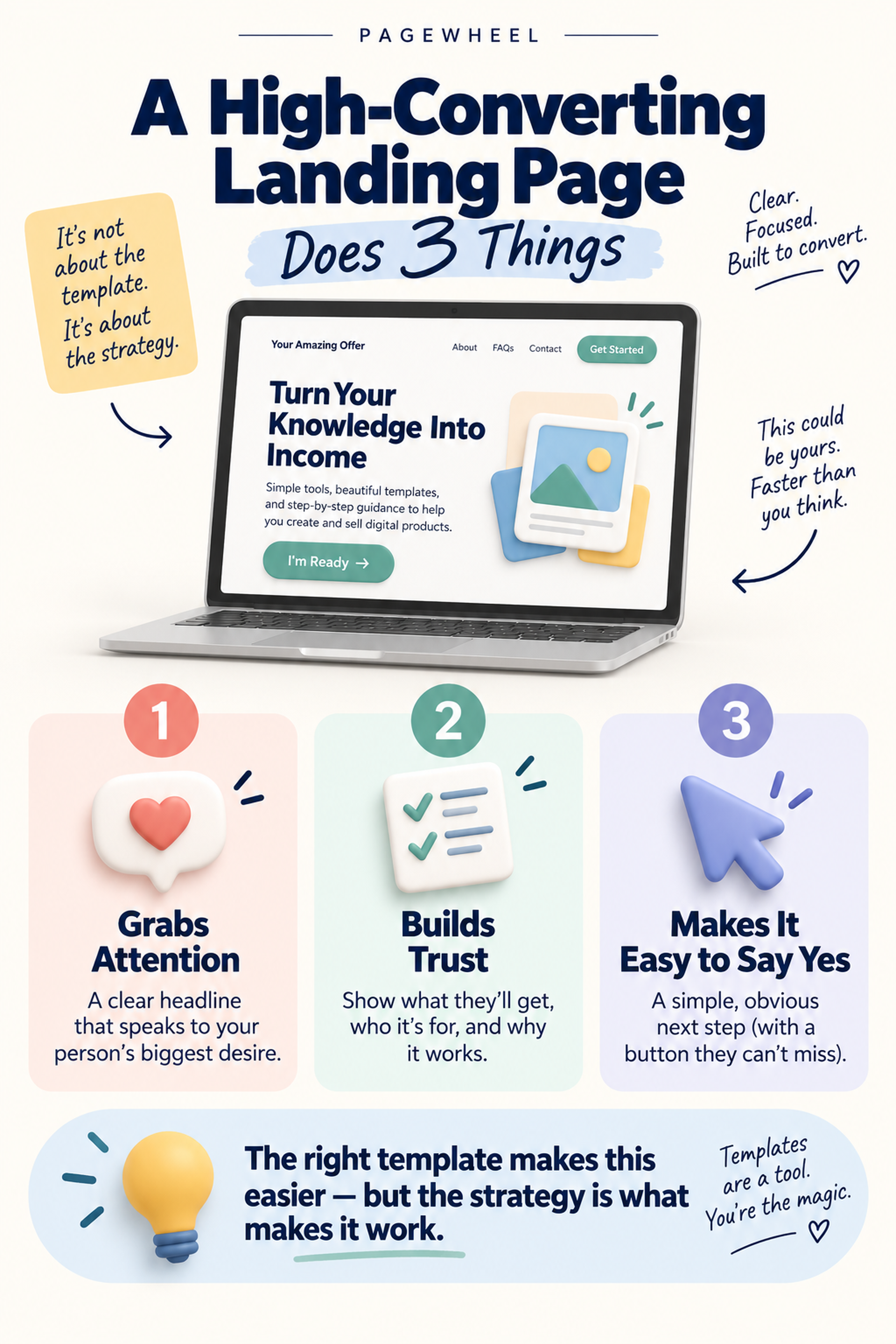
The structure is more important.
Choose a template that supports the conversion goal first. Your industry, branding, and visual preferences come after that decision.
–Unbounce
I agree.
A dark page is not automatically more persuasive than a light page. Rounded corners do not sell the course. Your favorite shade of blue cannot rescue a confusing offer.
The template trap: Choosing a page because it looks nice is easy. Choosing one because its structure fits the offer is what makes it useful.
Template or No Template?
A template is one way to begin. It is not the only way.
You can start with a traditional template, ask AI to build the first version around your offer, or build a page from scratch.
Each approach has a place.
| Starting point | Best for | Main benefit | Main downside |
| Traditional template | A familiar offer that closely matches the example layout | You can see the page structure before you begin | You may spend hours forcing your offer into fixed sections |
| AI-built first draft | A creator who knows the offer but does not know the best page structure | The first page is shaped around the actual offer | You still need to review the promise, proof, images, and CTA |
| Blank page | An unusual offer with a tested custom strategy | Complete control | The blank page creates the most decisions and the slowest start |
I used to think more templates meant more freedom.
Now I think more templates often means more scrolling.
People ask how many templates Pagewheel has. That is not the point.
Unlimited choices do not get your work done. You need a page that fits your product well enough to edit, publish, and improve.
A product that is not launched will not sell.
The Pros and Cons of Landing Page Templates
Templates are useful because they hold decisions you should not have to reinvent every time.
A good template reminds you that the headline needs a result. It leaves room for proof. It gives the product a visual preview. It repeats the call to action after the reader has enough information to decide.
It may also contain headline and button patterns that have worked for other offers. You can adapt those patterns instead of trying to become a conversion copywriter before breakfast.
The downside is that a traditional template was built around somebody else’s offer.
If the example sells a three-module course and yours has eight modules, the section may not fit. If the template expects testimonials and this is your first product, you may have no honest content to put there. If it uses one product image and your product needs a six-page preview, you start fighting the layout.
| Template benefit | Template limitation | Pagewheel approach |
| Removes the blank page | The original layout may not match your offer | AI builds a first version around what you are selling |
| Provides a logical section order | Fixed sections can feel restrictive | Sections can be added, removed, expanded, or reorganized |
| Gives you headline and CTA patterns | Placeholder language can make pages sound alike | The copy is generated from your offer, then edited in your voice |
| Creates a professional starting design | Choosing by color can distract from the goal | Start with the action and offer; change the visual style afterward |
| Saves structural decisions | A huge gallery creates choice paralysis | Use the offer to narrow the structure instead of scrolling forever |
This is why I like templates.
It is also why I do not want Pagewheel users stuck inside a static one.
Pagewheel combines the speed of a template with the flexibility of a custom page.
Choose Your Template With Three Decisions
You do not need to inspect every landing page template in the library.
Make three decisions first.
1. Name the Offer
Start with what the visitor is getting.
A free checklist needs a different page than a $1,000 coaching program. The checklist needs a clear promise and a simple form. The coaching program needs enough detail and proof to support a much larger decision.
Choose the closest offer type:
- Lead magnet
- Ebook or digital download
- Course
- Webinar or event
- Coaching or service
- General digital product
2. Name the Proof
Proof helps the visitor believe the promise.
You may have customer testimonials, screenshots, results, credentials, years of experience, media mentions, or a useful demonstration of the product.
A brand-new offer may not have customer testimonials yet. Use the proof you actually have. Show the product. Explain the method. Tell the relevant part of your own story. Be specific about what is included.
Empty testimonial boxes are not proof.
3. Name the One Action
Decide what the visitor should do next:
- Download the guide
- Buy the product
- Join the waitlist
- Register for the webinar
- Book the call.
One page can contain the same CTA button more than once. That is still one action.
The problem starts when one page asks the visitor to buy a course, read three blog posts, follow four social accounts, download a freebie, and subscribe to YouTube.
That is not a landing page.
That is a scavenger hunt and distracts your visitor from the ONE thing you want them to do.
The Template Decision Flow
| Your offer | The page’s one action | Best starting structure |
| Free checklist, guide, or quiz | Submit an email address | Short lead magnet page |
| Ebook, template, or digital download | Buy now | Product sales page with preview |
| Online course | Enroll | Longer course page with curriculum and proof |
| Webinar or event | Register | Registration page with date, takeaways, and speaker proof |
| Coaching or service | Book or apply | Fit-focused service page with process and testimonials |
| Other digital product | Buy or join | Flexible sales page built around the buyer’s questions |
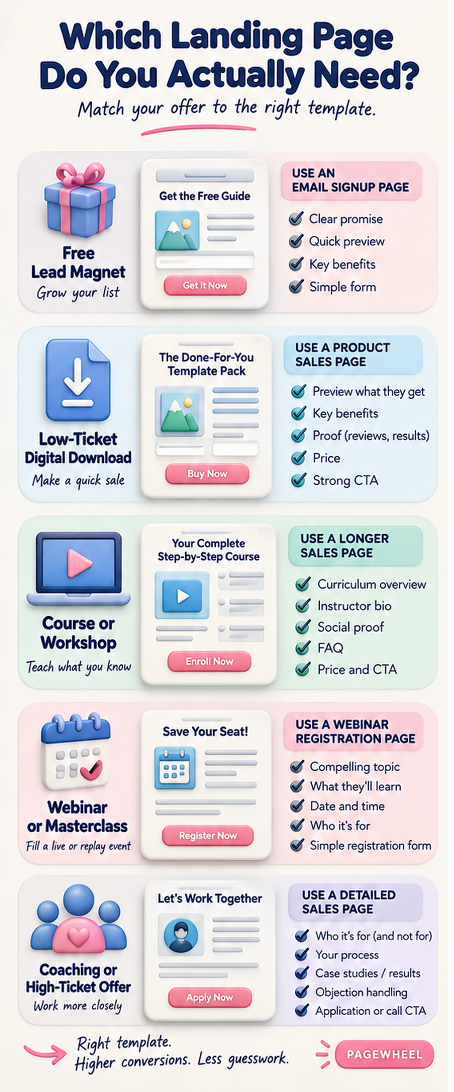
In Pagewheel, you can describe the offer and let AI build the first version instead of answering every layout question manually. Pagewheel’s current product pages describe an AI-powered page builder with built-in templates, mobile-responsive pages, funnel creation, hosting, product delivery, and promotional content.
The AI gets you past the blank page.
You make the page accurate.
Six Landing Page Templates for Creator Offers
The right template depends on how much the visitor needs to understand and believe before acting.
Lead Magnet Landing Page Template
A lead magnet page should be short.
The visitor is trading an email address for a useful resource. Show the result, the resource, and the form.
| Required sections | Helpful additions | CTA example |
| Benefit-driven headline, short explanation, three benefits, email form | Product mockup, creator photo, privacy note | “Send Me the Free Guide” |
Ebook or Digital Download Landing Page Template
A paid download needs more information than a free lead magnet.
Show what the buyer gets. Include a preview. Explain the specific problem it solves. Add proof when you have it.
| Required sections | Helpful additions | CTA example |
| Headline, product preview, core benefits, what is included, price, CTA | Table of contents, sample pages, testimonial, guarantee | “Get the Guide” |
Course Landing Page Template
A course usually needs a longer page because the buyer is considering a larger commitment of time and money.
Make the curriculum visible. Introduce the instructor. Show student results. Answer the questions that could stop enrollment.
| Required sections | Helpful additions | CTA example |
| Transformation headline, curriculum, instructor, student proof, price, FAQ, CTA | Lesson preview, bonuses, guarantee, payment plan | “Start the Course” |
Webinar or Event Landing Page Template
An event page needs clarity fast.
State the date, time, topic, and what the attendee will learn. Add the speaker’s relevant experience. Make registration obvious.
| Required sections | Helpful additions | CTA example |
| Event headline, date and time, three takeaways, speaker, registration form | Countdown for a real deadline, agenda, attendee proof | “Save My Seat” |
Coaching or Service Landing Page Template
A coaching page needs to establish fit.
Explain the result, the process, who the offer is for, and the next step. A higher-priced service may need substantial proof and objection handling.
| Required sections | Helpful additions | CTA example |
| Outcome, fit, process, testimonials, coach bio, booking or application CTA | Case study, FAQ, service levels, disqualification section | “Book My Call” |
General Sales Landing Page Template
A flexible sales page works for workshops, memberships, toolkits, subscriptions, bundles, and other digital products that do not fit a tidy category.
Start with the same customer questions: what is it, is it for me, can I trust it, and what do I do next?
| Required sections | Helpful additions | CTA example |
| Headline, problem and solution, preview, benefits, proof, price, CTA | Comparison, guarantee, FAQ, order bump preview | “Get Instant Access” |
The important word here is starting.
Your template can change as your offer changes.
If three benefits are not enough, use five. If the product needs six images, show six. If the course needs a curriculum section and the original page does not have one, add it.
The page works for the offer.
The offer does not work for the template.
The Anatomy of a Useful Landing Page Template
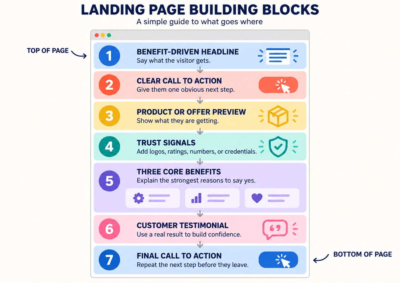
The dark, high-contrast example created for this article contains seven strong conversion elements:
- A benefit-driven headline
- A clear call to action
- A product preview
- Trust signals
- Three core benefits
- A customer testimonial
- A final CTA section
That is a solid page flow because each section answers a question in the visitor’s mind.
| Page section | What it does | Question it answers |
| Benefit-driven headline | States the result or useful change | “What will this help me do?” |
| Supporting sentence | Names the person, problem, or method | “Is this meant for me?” |
| First CTA | Makes the next step visible immediately | “What do I do?” |
| Product preview | Shows the file, course, service, or experience | “What am I actually getting?” |
| Trust signals | Adds credentials, recognizable logos, data, or other honest evidence | “Can I trust this?” |
| Core benefits | Explains how the offer makes the next step easier | “Why would I want it?” |
| Customer testimonial | Shows a real person’s experience | “Has this helped somebody like me?” |
| Final CTA | Repeats the same action after the explanation | “I am ready. Where do I click?” |
Not every page needs every section.
A new product without testimonials can use a strong preview, relevant experience, or a clear explanation of the method. A free checklist may not need a long founder story. A complex course may need a curriculum, FAQ, guarantee, and multiple examples.
The template is not a checklist you obey.
It is a conversation you organize.
Five Things to Customize Before Publishing
Pagewheel can create the first page quickly. Your job is to make five high-signal parts true and specific.
1. Promise
The headline should state the useful result.
“Learn Meal Planning” is a topic.
“Plan Five Weeknight Dinners in 20 Minutes” is a promise the reader can picture.
2. Proof
Replace generic praise with real evidence.
Use a customer quote, a result, your relevant experience, a product demonstration, or a clear explanation of why the method works.
3. Preview
Show the thing.
Use a product mockup, sample page, curriculum screenshot, lesson preview, workbook page, or short video.
A preview makes a digital product feel real.
4. Personality
Change the colors, images, and language so the page belongs to you.
Keep the visual choices simple. The button should stand out. The text should be easy to read. The page should look like the product the visitor is about to receive.
5. CTA
Use one clear action.
“Submit” describes what a form does.
“Send Me the Guide” describes what the visitor gets.
Keep the same action across the page, even when the button appears more than once.
The Five-Minute Review
| Check | Ask yourself |
| Promise | Can a visitor explain the result after reading one sentence? |
| Proof | Is every claim supported by something honest and specific? |
| Preview | Can the visitor see what they are getting? |
| Personality | Does the page look and sound like this offer? |
| CTA | Is the next action obvious and consistent? |
The five-minute review does not mean every page takes five minutes to finish.
It means these five decisions deserve your attention before you change another shade of blue.
How Long Should the Landing Page Be?
A page should be long enough to support the decision.
No longer.
I use this simple formula:
Page length = offer complexity + price + trust gap
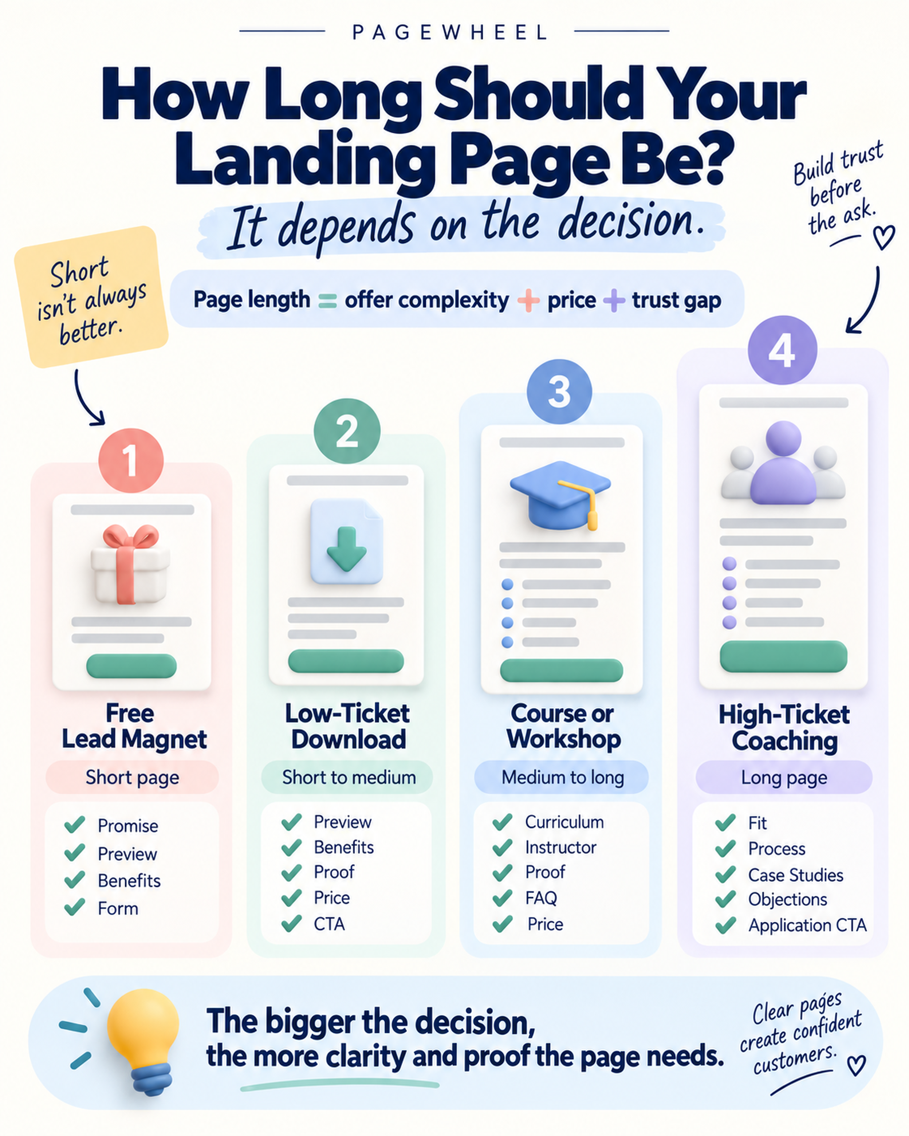
A free guide from someone the visitor already follows may need a headline, three benefits, a preview, and a form.
A high-priced coaching offer from someone the visitor just discovered needs more explanation and more proof.
| Offer | Typical trust needed | Useful starting length | Sections to prioritize |
| Free lead magnet | Low | Short | Promise, preview, benefits, form |
| Low-ticket download | Low to moderate | Short to medium | Preview, benefits, proof, price, CTA |
| Course or workshop | Moderate | Medium to long | Curriculum, instructor, proof, FAQ, price |
| High-ticket coaching or service | High | Long | Fit, process, case studies, objections, application CTA |
Price matters.
Trust matters more than people think.
A loyal audience may buy a $100 product from a short page because the relationship already did part of the selling. A stranger may need much more information before buying the same product.
Pagewheel gives you a starting structure. You can expand or shorten it to match the real decision.
Your Landing Page Is Not the Whole Funnel
The landing page is one part of a larger automated sales funnel.
The landing page gets the click.
The checkout collects the payment.
The thank-you and delivery pages complete the promise.
The follow-up helps the customer use what they bought or hear about the next relevant offer.
| Step | Main job | Tool |
| Landing page | Explain the offer and earn the click | Pagewheel |
| Checkout | Collect payment and order information | Digistore24 |
| Thank-you and delivery | Confirm the purchase and provide access | Pagewheel connected to Digistore24 |
| Follow-up and promotion | Support the buyer and continue the conversation | Pagewheel assets and connected tools |
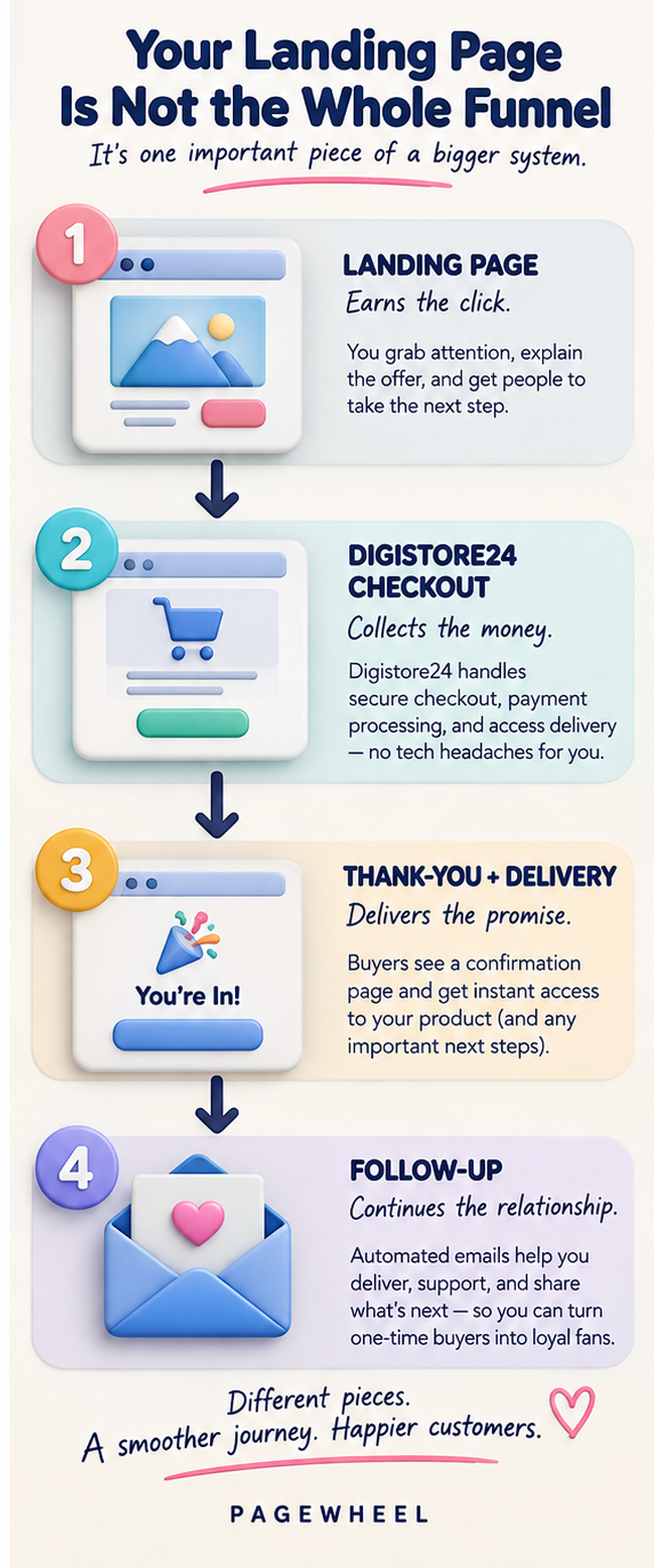
Pagewheel can generate a payment button that sends the buyer directly to the connected Digistore24 checkout. Digistore24’s Cart Builder provides customizable order forms, proven checkout templates, mobile optimization, and split testing.
The design should feel consistent enough that the buyer does not wonder whether the checkout belongs to a different company.
Your landing page gets the click.
Your checkout gets the money.
They need to work together.
Five Changes That Make a Template Work Better
I would make these changes before worrying about whether the page is pretty enough.
| If the page has… | Change it to… |
| A layout chosen mainly for its colors | A structure chosen for the offer and action |
| A short page for a complex, expensive offer | Enough explanation and proof to support the decision |
| Placeholder copy left in place | Specific language about your buyer and product |
| Several unrelated actions | One CTA repeated where it is useful |
| A rigid three-item or two-image section | The number of benefits, images, or examples the offer actually needs |
Then open the page on your phone.
Read the headline. Tap the button. Complete the form or checkout. Open the delivery email. Download the product.
You are not admiring the page.
You are testing the customer’s path.